The seat selection process in movie ticket booking is a critical step that directly impacts user satisfaction and ticket sales. A poorly designed interface can frustrate users, leading to abandoned bookings, while a smooth and intuitive system encourages purchases and repeat visits. Here's what matters most:
- Clarity: Users need to easily understand theater layouts, seat availability, and pricing.
- Speed: Quick and simple navigation reduces drop-offs.
- Mobile Optimization: Interfaces must work well on smaller screens with touch-friendly designs.
- Accessibility: Inclusive features like wheelchair seat markers, screen reader support, and keyboard navigation are essential.
Modern systems solve issues like unclear layouts, confusing pricing, and accessibility gaps. Examples include graphical seat maps, hybrid designs for desktop and mobile, and streamlined booking flows that integrate payment and concessions. Filmgrail stands out by combining user-friendly features with engaging tools like trailers and loyalty integrations, helping cinemas increase digital ticket sales by 89%.
Key Takeaways:
- Clear, accessible, and mobile-friendly designs boost user satisfaction and sales.
- Streamlining seat selection, payment, and concessions reduces booking drop-offs.
- Features like real-time updates and transparent pricing build trust and ease the process.
Build a Movie Seat Booking App in Angular | BookMyShow Clone with Seat Selection Logic
Seat Selection UI Case Studies
Case studies demonstrate how thoughtful UI design can significantly improve user engagement and booking rates. Below are examples of how addressing specific challenges through smart UI decisions can enhance user satisfaction and lead to better business results.
Accessible Seat Selection Design
A theater chain struggled with making wheelchair-accessible seating easier to book, as these options were buried in a hidden menu. To solve this, they worked with accessibility experts to revamp their interface. The updated design prominently displayed accessible seating options directly on the theater map using high-contrast visual markers. It also included enhancements like better screen reader compatibility and larger touch targets for mobile users. Additional details, such as companion seating availability and proximity to facilities, appear when users hover or tap on the seats. A voice navigation feature was also introduced, enabling commands like "show accessible seats" to highlight relevant options instantly. These changes led to a noticeable increase in engagement for accessible seating bookings.
Visual Representation: Graphical vs. List-Based Interfaces
A media company explored different ways to present seating options and conducted tests to compare two approaches. The first approach used a detailed graphical seat map that showed individual seats along with visual indicators for pricing and real-time availability. This method offered valuable context and was particularly effective for desktop users. The second approach used a simpler list-based format, organizing seats by row and section with clear pricing and brief descriptions. This format worked better for mobile users, as it reduced cognitive load and was easier to navigate on smaller screens. Insights from the study revealed that preferences varied based on device type and user demographics. Ultimately, the company adopted a hybrid approach, automatically adjusting the interface to suit the user’s device and preferred style.
Simplified Booking and Payment Integration
Another case focused on reducing booking abandonment caused by a fragmented user experience. Previously, users had to navigate separate screens for seat selection, concessions, and payment, which led to frequent drop-offs. The redesigned system combined these steps into a single, seamless flow. A sidebar displayed selected seats and live pricing throughout the process, while an integrated "Add Concessions" feature allowed users to browse snacks and drinks without leaving the seat selection page. One-click upselling for premium seating and streamlined payment through integrated authentication further simplified the experience. Real-time inventory updates prevented booking errors, and performance enhancements ensured the system worked smoothly even on mobile devices with limited connectivity.
Design Insights from Developers and Designers
Creating an effective seat selection interface requires balancing user expectations with technical constraints. Developers and designers agree that these interfaces should remain smooth and engaging throughout the booking process to ensure a positive user experience.
Best Practices for Prototyping and Testing
Successful seat selection interfaces are the result of thorough, iterative testing that starts early in the design process. Early-stage prototypes - like paper sketches or simple wireframes - are great for validating initial concepts. Interestingly, research shows that using low-fidelity prototypes can uncover 75% of usability issues. These simple tools allow teams to focus on functionality without getting bogged down by visual details.
As the design progresses, high-fidelity prototypes become crucial. These help teams test specific interactions and identify performance bottlenecks. The choice of testing methods matters too. Moderated tests work well for understanding detailed user challenges, while unmoderated tests are ideal for collecting quantitative data on task completion.
Combining qualitative and quantitative research methods gives a more complete understanding of user behavior. For example, qualitative insights can explain why users prefer a certain layout, while quantitative data can show which design leads to better conversion rates.
Testing shouldn't be a one-and-done activity. Iterative testing - starting with the first prototype and continuing through major revisions and pre-launch - helps avoid costly fixes later. Recruiting participants who reflect the target audience, like frequent moviegoers or occasional visitors, ensures feedback is relevant and actionable.
Next, we’ll explore common mistakes developers make during testing and how to avoid them.
Common Mistakes and How to Avoid Them
One major mistake is putting too much emphasis on early prototypes. When teams get overly attached to initial designs, they may resist necessary changes, compromising the final product. Using simple, functional prototypes can help keep feedback honest and actionable.
Another misstep is asking leading questions during testing. For example, instead of asking, "How easy was it to find premium seats?" try a neutral prompt like, "Tell me about your experience selecting seats." This approach encourages open and detailed feedback.
Testing in unrealistic conditions is another trap. Many users book tickets on mobile devices while on the go, so it’s essential to test under real-world conditions, including varying network speeds.
Negative feedback can be a goldmine for improvement. Users who struggle with the interface often highlight areas that need the most attention. On the flip side, poorly optimized prototypes - those that are slow or glitchy - can frustrate users and lead to abandonment during testing. Ensuring prototypes are functional and fast is critical.
Realistic scenarios are key to uncovering genuine usability issues. For instance, testing scenarios like booking tickets for a group or selecting accessible seating can reveal challenges that might not surface in controlled environments.
Finally, skipping post-launch evaluations is a missed opportunity. Real-world usage provides invaluable insights that can help refine the interface even further, ensuring it continues to meet user needs effectively.
sbb-itb-b1b0647
US Market Considerations
When creating seat selection interfaces for US users, localization involves more than just translating text. It requires tailoring the experience to meet American expectations, from formatting standards to accessibility needs. These details are vital for providing a smooth and intuitive booking process.
Adapting Formats for the US Market
Currency and pricing should always follow US conventions, displaying the dollar sign ($) before the amount and using commas as thousand separators. For instance, premium seats should appear as "$15.50" instead of "15.50 USD" or "15,50 $". Small as it may seem, this detail can significantly impact user trust and ease of understanding during payment.
Date formats in the US follow the MM/DD/YYYY structure. For example, a movie date of March 15, 2025, should be shown as "03/15/2025" or "Mar 15, 2025." Using the international DD/MM/YYYY format could confuse users and lead to booking mistakes.
Time displays must use the 12-hour clock with AM/PM indicators. A showtime like "7:30 PM" feels natural to US users, whereas "19:30" might require extra mental effort, potentially slowing down the process.
Language preferences are also important. Stick to American English conventions, such as "theater" instead of "theatre", "center" instead of "centre", and "favorite" instead of "favourite." These choices not only align with user expectations but also improve search functionality and interface clarity.
For spatial references, use imperial units, like feet and inches, rather than metric measurements. If temperature is mentioned, it should be displayed in Fahrenheit.
These adjustments form the groundwork for ensuring the interface aligns with US accessibility standards.
Accessibility Standards and Compliance
Beyond format adjustments, accessibility compliance is critical for delivering a seamless booking experience in the US. The Americans with Disabilities Act (ADA) mandates digital accessibility, directly affecting seat selection interfaces. These requirements aren't just legal - they're essential for creating inclusive and user-friendly experiences.
Screen reader compatibility is a top priority. Interfaces must use proper HTML structure and ARIA labels to ensure all elements are accessible. Seat selection grids should be navigable using a keyboard, with audio descriptions detailing seat location, availability, and pricing. For example, a seat should be described as "Row C, Seat 8, Standard seat, Available, $12.50" rather than relying solely on visual cues.
Color contrast ratios must meet WCAG 2.1 AA standards, ensuring text and visual elements are easy to distinguish. For example, normal text should have a minimum contrast ratio of 4.5:1, while large text requires at least 3:1. Additionally, seat statuses - like available, unavailable, or selected - shouldn't rely solely on color. Patterns, textures, or icons should complement color coding.
Keyboard navigation is essential for users who can't rely on a mouse. Arrow keys should allow movement through the seat map, with clear focus indicators highlighting the selected seat. The Tab key should navigate logically between sections, and pressing Enter or Space should confirm selections.
Motor accessibility involves designing interfaces that accommodate users with limited dexterity. Clickable areas, especially on mobile devices, should be at least 44x44 pixels to ensure ease of use.
Cognitive accessibility focuses on simplicity and clarity. Use straightforward language and consistent design patterns. Error messages should guide users toward solutions, such as "This seat is unavailable. Please select a different seat", instead of vague messages like "Error."
Support for alternative input methods is also crucial. Interfaces should work seamlessly with voice control, switch navigation, and other assistive technologies, ensuring accessibility for a wide range of users.
Compliance with US accessibility standards isn't just about avoiding legal issues - it's an opportunity to enhance the overall user experience. Accessible designs often benefit all users, leading to better usability, higher satisfaction, and improved conversion rates.
Filmgrail's Approach to Seat Selection
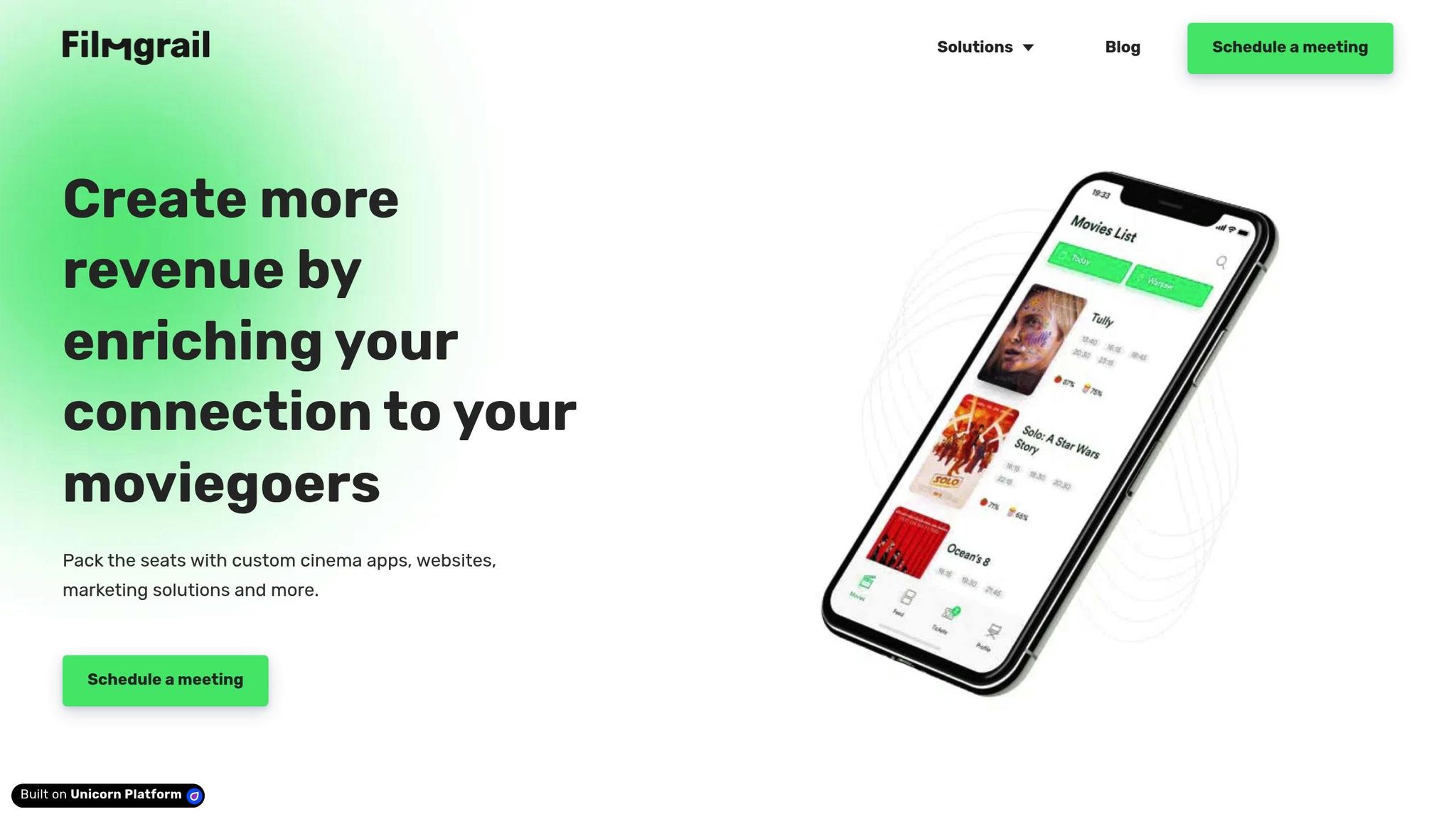
Filmgrail takes seat selection to a new level by blending smart technology with user-friendly features, making the process more engaging and efficient. Instead of sticking to basic ticketing systems, Filmgrail addresses common challenges like confusing layouts and clunky booking steps. Their approach combines interactive tools and thoughtful design to create a smoother experience for moviegoers while helping cinemas boost revenue.
Using Technology to Drive Engagement
One of Filmgrail's standout features is its ability to captivate users as they book their tickets. Trailers automatically play during the booking process, giving users a sneak peek at upcoming films while they browse showtimes and seats. Local audience reviews and ratings are integrated into the platform, providing real-time insights to help users choose both the right movie and the perfect seat. To make the experience even more immersive, the platform includes video stories featuring behind-the-scenes content, cast interviews, and movie highlights.
Push notifications keep users informed about movies they've added to their watchlists, offering updates on showtimes, seat availability, and exclusive promotions. Whether users are on the web or mobile apps for iOS and Android, Filmgrail ensures a fast, seamless experience with quick loading times and easy navigation.
A striking 90% of Filmgrail users create profiles, giving theaters valuable insights into customer preferences. This high engagement rate highlights how well the platform keeps users connected and invested, ultimately paving the way for a hassle-free checkout process that boosts revenue.
Increasing Revenue Through Better User Experience
Filmgrail's optimized checkout process is a game-changer for cinemas. By eliminating common pain points in traditional ticketing systems, the platform ensures a smooth transition from seat selection to payment, turning casual browsers into committed buyers.
Cinemas partnering with Filmgrail have reported an 89% annual increase in digital ticket sales. Additionally, the platform delivers four times more engagement from moviegoers compared to standard ticketing websites and apps.
"Filmgrail has played a determining role in helping us grow our mobile presence and providing an outstanding moviegoing experience beyond the big screen."
Daniel Eikeland, Sales & Service Manager at Bergen Kino
Filmgrail also equips cinemas with powerful analytics tools to track user behavior during the seat selection process. These insights help theaters pinpoint areas for improvement and better understand customer preferences. The platform's integration with loyalty programs simplifies the checkout process by automatically applying rewards and discounts, encouraging customers to return for future visits. By combining convenience with personalization, Filmgrail helps cinemas build stronger connections with their audiences.
Conclusion and Key Takeaways
Case studies highlight how crucial well-designed seat selection interfaces are for the success of modern cinemas. A user-friendly system not only simplifies the booking process but also boosts revenue, improves customer satisfaction, and encourages loyalty. The contrast between a clunky, outdated interface and a smooth, intuitive one can significantly impact overall customer experience. Let’s dive into the main takeaways.
Lessons Learned from Case Studies
The most effective seat selection systems share some common traits that cinema operators should focus on:
- Accessibility and clarity: Interfaces should be easy to navigate for all users, with clear displays of seat availability, pricing, and theater layouts.
- Seamless integration: Smooth transitions between seat selection, payment, and loyalty programs reduce friction and improve the user journey.
- Mobile optimization: Fast-loading, mobile-friendly platforms are now essential for driving conversions.
Additionally, real-time updates and transparent pricing help prevent errors and eliminate unpleasant surprises, like unexpected fees. Filmgrail is a great example of how modern digital solutions can elevate this process.
Final Thoughts on Filmgrail's Role
Filmgrail stands out by combining efficient booking with engaging content features. From auto-playing trailers and video stories to personalized push notifications and watchlist tools, it caters to both the entertainment and practical needs of today’s moviegoers.
FAQs
How does Filmgrail's seat selection interface improve the movie ticket booking experience?
Filmgrail’s seat selection interface is built to streamline the ticket booking experience and make it more enjoyable. With its clear and user-friendly design, moviegoers can quickly check real-time seat availability and choose their preferred spots without any hassle.
The inclusion of interactive seat maps and tailored recommendations takes the experience up a notch, offering a faster and smoother process. By cutting down on confusion and making booking easier, Filmgrail helps cinemas build stronger connections with their customers, encouraging them to return time and time again.
What accessibility features should a modern seat selection interface include to meet US standards?
To create a seat selection interface that complies with US accessibility standards, inclusivity must be at the forefront of its design. Essential features include screen reader compatibility, keyboard-friendly navigation, and options to adjust font sizes and color contrast for improved readability. Adding clear visual indicators for seat availability and providing alternative text for images and icons ensures the interface supports users with visual impairments.
Additionally, using straightforward language and designing an intuitive interface benefits all users, making navigation easier and more efficient. These elements align with the Americans with Disabilities Act (ADA) and the Web Content Accessibility Guidelines (WCAG) 2.1, ensuring a smooth and accessible experience for every moviegoer.
Why is mobile optimization essential for seat selection interfaces, and how does it improve the booking experience?
When it comes to mobile devices, getting the seat selection interface right is crucial. Why? Because a smooth, easy-to-use design on smaller screens makes it hassle-free for customers to pick their seats and finish their bookings without any headaches.
A thoughtfully crafted mobile interface does more than just look good - it helps cut down on abandoned carts, speeds up the checkout process, and encourages more completed reservations. By focusing on making mobile navigation simple and intuitive, cinemas can not only boost customer satisfaction but also drive ticket sales, giving moviegoers a stress-free way to book their seats.