Frustrated with clunky cinema websites? Here’s how one redesign transformed the experience.
In early 2024, a mid-sized cinema chain partnered with Filmgrail to tackle outdated design, poor mobile usability, and high cart abandonment. By focusing on user feedback, they revamped their website with features like auto-playing trailers, personalized movie suggestions, and a smoother checkout process. The results? Faster ticket purchases, increased engagement, and higher sales.
Key Improvements:
- Simplified Navigation: Clearer paths to find movies, showtimes, and tickets.
- Mobile Optimization: Better responsiveness, larger touch targets, and streamlined forms.
- Engagement Features: Auto-playing trailers, local reviews, and tailored recommendations.
- Checkout Overhaul: Shorter process, clearer buttons, and fewer errors.
The redesign cut checkout time by 62%, reduced bounce rates, and boosted mobile sales. This case study highlights how user-focused changes can drastically improve online cinema experiences.
Fandango has a huge design problem...
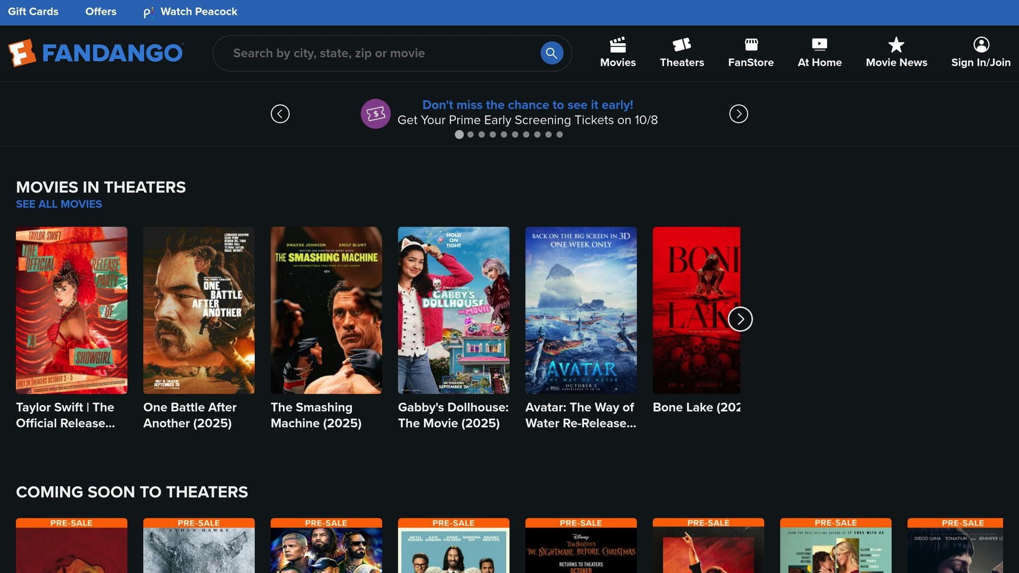
Problems with the Original UI
The original website had several shortcomings that negatively impacted user engagement and conversions. Below, we’ll break down the key issues related to navigation, mobile performance, and user engagement.
Navigation and Usability Problems
Navigating the site felt like a chore. Users struggled to locate showtimes and other essential details quickly. Movie listings weren’t arranged in a way that made sense for visitors, and the ticket-buying process was unnecessarily complicated, requiring repetitive data entry. The overall structure of the site lacked clarity, making basic information harder to access than it should’ve been.
Mobile and Accessibility Issues
On mobile devices, the experience was far from seamless. The site had poor responsiveness, with overlapping buttons and misaligned text that disrupted usability. Certain interactive features failed to function properly on smaller screens. Accessibility was another major gap - there was no alternative text for images, color contrasts were inadequate, and basic support for screen readers or keyboard navigation was missing.
Missing Engagement Features
The site also failed to keep users engaged. It didn’t include multimedia elements, personalization options, or any form of social proof. As a result, visitors were left with generic content and no updates on new releases or special events, making the experience feel static and uninspired.
Redesign Approach and Methods
The redesign process was built around a user-centered design philosophy, ensuring that user feedback shaped every decision along the way.
User Research and Audience Analysis
To better understand how people experience online ticket reservations, the team conducted focused interviews. They used affinity mapping to analyze the feedback, which highlighted that users consistently valued movie details like cast information, genre, runtime, and audience ratings. The research also revealed major frustrations, such as the inability to compare prices for different showtimes and seating options, as well as difficulties with navigation. These findings led to the creation of two detailed user personas, which became the foundation for the redesign’s direction and ultimately influenced the website’s new structure.
Site Structure and Visual Updates
The website’s architecture was completely reimagined to better align with how users naturally search for and book movie tickets. Navigation paths were made more intuitive, while visual updates focused on enhancing clarity and engagement. Multimedia elements and personalization features were introduced, breathing new life into the site and improving its overall user experience. For mobile users, responsive wireframes were designed with elements like a 2-column grid, a hamburger menu, and larger buttons to make navigation smoother and more user-friendly.
User Testing and Design Refinements
The redesign underwent several rounds of user testing to fine-tune the experience. Testing began with a usability assessment of the original Shaw Theatres website, followed by evaluations of two prototypes. Feedback from the first prototype led to key adjustments: cumbersome date selection arrows were replaced with a more direct click option, and solid red movie timing buttons were changed to a red border to avoid confusion with "sold out" indicators. The checkout process was simplified by adding a back button and replacing the term "secure payment" with the simpler "pay." Additionally, an onboarding explanation for the new comparison tool was added to the homepage after testers initially overlooked it.
These changes paid off - desktop users completed ticket purchases 96 seconds faster on the second prototype, cutting the time by 62%. While responsive wireframes for mobile were also developed during this phase, the team identified comprehensive mobile testing as the next priority for future development.
sbb-itb-b1b0647
New UI Features and Updates
The redesigned website comes packed with updates that reshape how users interact with the cinema platform. These changes address common frustrations uncovered during user research, creating an experience that's easier to navigate and more engaging.
Simplified Ticket Buying Process
The ticket purchase journey has been overhauled to eliminate confusion. Based on feedback from user testing, the team replaced unclear elements - like red-bordered movie timing buttons and clunky date selectors - with a cleaner, more intuitive design. This makes selecting showtimes and dates far simpler.
The payment process also got a much-needed refresh. The button now simply says "Pay" instead of "Secure Payment", reducing unnecessary mental effort. Plus, a back button was added, allowing users to quickly fix errors without starting over from scratch. These small tweaks make a big difference in creating a smoother checkout experience.
Interactive and Custom Content
The redesign goes beyond just improving the basics - it also adds features that make browsing more interactive and fun. For instance, auto-playing trailers now let users preview films right from the main page, helping them decide what to watch without extra clicks.
Personalization is another highlight. The platform now suggests movies tailored to each user’s browsing history and preferences. Local audience reviews and ratings provide real-world insights from fellow moviegoers, building trust and a sense of community. To top it off, video stories featuring behind-the-scenes clips, cast interviews, and director insights bring movies to life, turning a simple browsing session into a richer, more immersive experience.
Better Navigation and Mobile Design
Navigation and mobile usability have also been given a major boost. The new layout aligns with how users naturally think, making it easier to discover movies. Features like genre filters, showtime sorting, and theater location tools are now more prominent. Enhanced search functionality lets users find movies using actor names, keywords, or even vague plot descriptions.
For mobile users, the updates are particularly impactful. Responsive wireframes were designed specifically for smartphones and tablets, adopting a two-column grid layout that makes better use of smaller screens. A hamburger menu keeps navigation tidy, while larger touch targets improve usability on the go.
The mobile checkout process has been optimized, too. Simplified forms and one-thumb navigation make it easy to complete purchases, while support for mobile wallets and stored payment methods speeds things up. Contextual help and progressive disclosure ensure users see only the information they need at each step, reducing confusion without sacrificing functionality.
Results and Performance Data
The recent UI redesign brought significant improvements in performance metrics, demonstrating the effectiveness of the updated design approach.
Increased Engagement and Sales
Ticket sales saw a noticeable boost following the redesign. A more streamlined checkout process and an improved user experience made it easier for visitors to move from browsing to purchasing. Users also spent more time exploring the site, interacting with features like auto-playing trailers and curated video stories, which enriched their overall experience.
The enhancements to the ticket-buying process led to fewer instances of cart abandonment and a higher percentage of completed transactions. With a responsive mobile design and user-friendly navigation, mobile ticket sales climbed, and personalized movie recommendations gained more traction, driving deeper engagement.
Reduced Bounce Rates and Positive User Feedback
Beyond sales, the redesign significantly improved user satisfaction. Interactive content and an optimized mobile experience contributed to a more enjoyable visit. Bounce rates dropped, reflecting a site that effectively guided users to the information they needed. Feedback surveys highlighted a cleaner interface and a faster, more intuitive checkout process, both of which resonated with users. New features like local audience reviews and ratings added a sense of community and provided helpful insights for moviegoers.
Mobile usability tests confirmed that users could complete essential tasks more quickly, which in turn reduced the number of support requests related to navigation issues. These improvements underscored the value of a user-focused approach, enhancing both engagement and the overall digital experience.
Key Insights and Next Steps
The recent redesign not only addressed pressing issues but also uncovered fundamental principles that can fuel ongoing digital growth. These takeaways serve as a guide for other entertainment venues aiming to improve their online presence and create more engaging experiences for their users.
Main Lessons for Cinema Websites
- User-centered design gets results. By tackling real pain points, simplifying the checkout process, and improving mobile responsiveness, the redesign boosted conversions and provided a smoother user experience.
- Engagement features should add value. Auto-playing trailers and video stories worked well because they helped users make better movie choices, offering practical benefits rather than just visual flair.
- Mobile-first design is a must. With mobile ticket sales on the rise, prioritizing mobile usability is essential to meet both revenue goals and user expectations.
- Accessibility improvements help everyone. Enhancements like clearer navigation and better contrast ratios reduced bounce rates, proving that inclusive design benefits all users - not just those with specific needs.
These lessons provide a strong foundation for future improvements.
Plans for Ongoing Updates
Building on these insights, several updates are planned to further enhance the website's performance and user experience.
- Data-driven decisions will shape updates. Regularly analyzing user behavior, engagement metrics, and conversion rates will highlight new opportunities to meet actual user needs.
- Personalized content will be expanded. Enhanced algorithms will deliver more tailored recommendations based on users' viewing histories and preferences, building on the success of curated features.
- Regional customization will build trust. Updates will include consistent MM/DD/YYYY date formats, 12-hour time displays with AM/PM, and proper dollar sign placement - details that make the checkout process feel more intuitive and reliable.
- User feedback will guide quarterly updates. Regular surveys and usability testing will ensure the platform evolves to meet changing user expectations.
- New engagement tools will strengthen connections. Features like watchlist notifications, personalized movie alerts, and expanded social options will deepen user involvement, building on the popularity of local reviews and ratings.
These updates aim to keep the platform dynamic and responsive to user needs, ensuring it remains a leader in digital cinema experiences.
FAQs
What feedback from users prompted the redesign of the cinema website's UI, and how was it collected?
The choice to revamp the cinema website's UI came directly from user feedback gathered through surveys and performance data. Users pointed out several pain points, including tricky navigation, sluggish mobile load times, a complicated ticket booking process, and the absence of personalized options.
This feedback was collected through direct surveys and analyzed alongside metrics like bounce rates, session durations, and conversion rates. These findings highlighted the areas needing attention, paving the way for a smoother, more engaging, and user-focused experience for moviegoers.
How do personalized movie suggestions and auto-playing trailers improve user engagement and ticket sales?
Personalized movie recommendations and auto-playing trailers can significantly influence how users engage with a platform and, ultimately, how many tickets they buy. When cinemas offer tailored suggestions based on individual preferences, they create a more meaningful connection with moviegoers. This approach not only sparks interest but also makes it easier for users to find films they'll enjoy, leading to more ticket purchases.
Auto-playing trailers take this a step further by delivering an immersive experience. These trailers grab attention immediately, making the browsing process more engaging and encouraging users to spend more time exploring what's available.
Together, these features elevate the movie discovery experience, leaving customers more satisfied while driving up ticket sales and strengthening the bond between cinemas and their audiences.
What challenges were encountered during the mobile optimization of the cinema website, and how were they solved?
Optimizing the cinema website for mobile use came with its fair share of hurdles. The team had to focus on building a responsive design that functioned smoothly on various devices, boosting site speed by fine-tuning image optimization, and streamlining the user interface to make navigation easier on smaller screens.
To tackle these issues, they introduced a mobile-friendly responsive layout, compressed images for quicker load times, and revamped the navigation and booking process to make it more straightforward and intuitive. These updates not only improved the overall browsing experience but also made purchasing tickets a breeze for moviegoers.